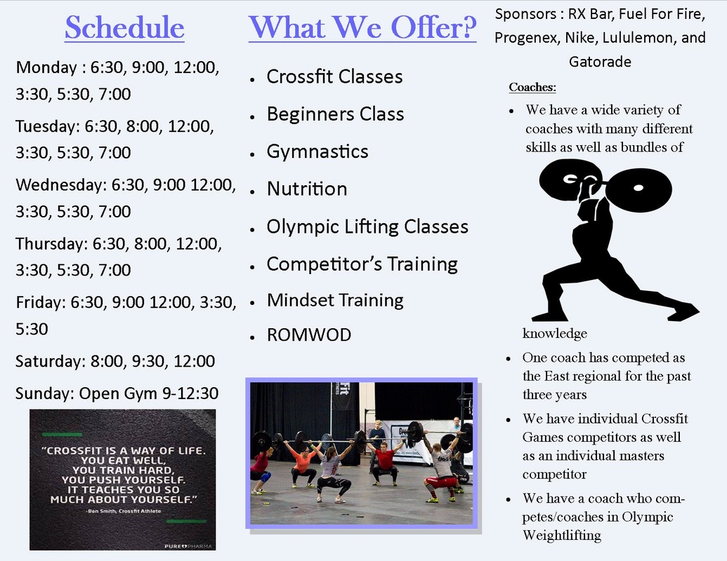
Magazine Project
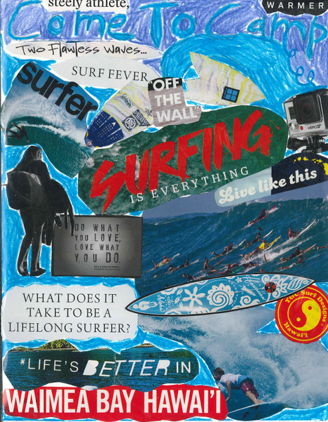
This collage is an advertisement for a surf camp incorporating color, contrast, and balance. There is balance between the color, for example the waves are blue so I tried to make every part of the collage include a shade of blue to tie it all in together. I also used the cut out of the surfer to make it unique compared to the other surfers who blend in to the wave. The "Do What You Love, Love What You Do" quote is supposed to ad character to ad, making the audience be able to relate more to what the collage is emphasizing. Having the "Surfing is Everything" picture shows how this ad is solely dedicated to the topic of surfing and relates to all the other pictures in the collage, helping with balance. Lastly, illustrating the title of "Come to Camp" in a warmer color makes the audience focus on the other pictures in the collage then make their curiosity lead them to the main purpose of the ad.
What Did I Learn?
Creating this collage helped my focus on the principles of design like balance and making sure my ad tied in together. I also learned how to attract attention to certain details by cutting them out a different shape or making them have more color then other pictures. Putting words that people may be able to relate taught me how to make the ad more appealing. I learned that anything someone remotely likes will attract their attention when it has the basic principles of design, most importantly color.
Creating this collage helped my focus on the principles of design like balance and making sure my ad tied in together. I also learned how to attract attention to certain details by cutting them out a different shape or making them have more color then other pictures. Putting words that people may be able to relate taught me how to make the ad more appealing. I learned that anything someone remotely likes will attract their attention when it has the basic principles of design, most importantly color.